Home / Work / UnitedHealthcare
Enabling the migration of a multi-product ecosystem to a single design system.
Context & background
Project overview
In early 2023, the consumer product organization embarked on a major shift to unify all products under a single design system, aiming to cut costs and enhance speed and quality. With seven distinct product areas involved, a diverse team of designers, product owners and engineers needed to collaborate. The migration, expected to complete by 2025, required careful planning and prioritization to avoid delays and frustrations, a challenge I eagerly embraced.
My role
Starting as a side project, I gradually became the design lead, guiding UX/UI designers in integrating the new design system to deliver a consistent experience for authenticated members. My focus was to address team frustrations and enhance consumer experiences. This case study details my role in the discovery phase and our strategy for the initial migration and future integration of the design system.
Discovery and research
A look at the approach taken to better understand the challenges with adoption, awareness and consistency of the design system.
Current state assessment: Assessed the current design assets, components and styles to find overlaps and inconsistencies. Collaborated with designers to prioritize the most important, foundational and commonly used components for initial attention.
Problem identification and stakeholder feedback: Met with and identified pain-points through interviews with designers, product owners, developers and a technical product manager. Shared findings with product leaders, the VP of design and UX senior/directors.
Analysis of other design systems: Reviewed various design systems to identify additional needs and to understand semantics, structure, organization and management of multi-product ecosystems.
Goal setting: Defined clear tactical goals for the migration as well as longer term objectives for scalability and sustainability.
Component Analysis, mapping and synthesis: Analyzed and compared various examples of similar components. Generated a list and lightweight wireframes/examples of enhancements required of the design system for current components.
Prioritization, sequencing and alignment: Informed by current product roadmaps, collaborated with the design system team on a prioritized set of enhancements and net-new needs.

Component analysis, mapping and synthesis: Current state consumer experiences were compared against each other as well as against what the design system component library and documentation already offered.

In collaboration with the consumer design team and design system team, we partnered to synthesize our findings into three core categories: 1. Enhancements to the design system, 2. Net-new components to be created and 3. Gaps in documentation to be filled.
Key problem areas identified
Team member frustration
Designers lacked proper documentation and necessary components, leading to detached components and undermining the design system.
Developers were unfamiliar with the design system, resulting designs being styled like the design system, instead of using pre-built components from the component repository.
Adoption issues
The design system was originally designed for different use cases and personas, causing it to not meet the expected adoption.
The small design system team had to prioritize tasks, which stressed both the team and its stakeholders. Demand was overwhelming the resources.
Communication breakdown
Internal friction arose between product teams and the design system due to ineffective communication channels.
Executive leadership mandated the design system adoption without a formal rollout plan, causing confusion and resistance.
Redundant problem-solving
Designers and developers were duplicating efforts by solving the same problems multiple times using different approaches.
A significant amount of design and technical debt was accumulating due to disjointed practices.
Organizational hurdles
Collaboration and partnership with the separate global, search and navigation product and design team were hampered by organizational divides.
Fragmented consumer experience
The consumer experience was fragmented across seven disparate UI kits and design systems.
While in some parts, the “Frankenstein” experience “got the job done,” but it was apparent it had an abundance of usability issues, lacked predictability and had differing implementations of compliance standards for Accessibility.
Project goals
Our initial discovery phase surfaced four goals focused on adoption, ease of use, efficiency, cost savings and user satisfaction.
Goal 1
Design system evolution and expansion
Enhance the design system's flexibility and documentation to facilitate its integration throughout the enterprise and within the Consumer Product portfolio.
Key Measurement: Increase in team adoption and components tailored to the member’s web responsive experience.
Goal 2
Enhanced employee experience
Simplify the design system’s usage for designers, product teams and developers working on MyUHC.
Foster efficiency, alignment, consistency and guidance in design and development processes.
Key Measurement: Increase usage documentation for designers, product teams and developers working on the web responsive portal experience.
Goal 3
Efficiency and Cost Savings
Minimize redundancy by eliminating duplicated problem-solving efforts in design and coding.
Accelerate project delivery timelines, leading to reduced time and cost expenditures.
Key Measurement: Decrease in task completion times for designers, increase in speed-to-market for product teams/developers, as well as a decrease in design and tech debt.
Goal 4
Elevated member experience
Deliver a more consistent, reliable and branded digital experience to enhance member satisfaction.
Establish predictability and trustworthiness in the user experience for the members served.
Key Measurement: Increase in site satisfaction, decrease in accessibility and usability issues.
Strategy
A look at the prioritized set of our focuses we’d be taking on for both the short migration and long-term needs of the design system.
Enhancements and net-new components (Short-term)
Enhance existing components in library: Create additional component variables for design and code, informed by the MyUHC web responsive experience and prioritized by product roadmap release dates. The initial scope was 12 common components and would expand thereafter.
Integrate the global UI into design and code libraries: Translate current global UI design work into performant, flexible and scalable design components of our most common components in the experience (ie. header, navbar, navmenu and footer.)
Fill gaps with net-new component creation: Design new, but needed components that do not currently exist in the system and deliver to the design system team for intake and implementation.
Introduce pattern templates: Develop a library of more robust UX patterns, focusing on specific areas like search and checkout.
Guidelines, design review and governance (Long-term)
Contextual style guide: Develop a style guide that demonstrates how to utilize the design system within the context of the MyUHC web responsive experience. Align this guide with the design principles and shared needs present in the native app experience for consistency.
Partnerships and alignment: Cultivate a collaborative relationship with the design system team to enhance consumer experience support. Establish regular communication with product teams to align with their roadmaps and assess design system feasibility.
Contribution model application: Make it easier for designers and non-designers to contribute to the design system.
Design governance process: Establish a systematic design governance process to oversee the evaluation, adoption and integration of new, improved and modified components and design patterns. Create a clear pathway for reviewing and consuming these design assets.
If the design system provides the ingredients, then the product pattern library and style guide are the recipes that make up any one product’s user experience.

I was often tasked with educating designers and non-designers about the distinct differences and relationships between a design system, pattern library and style guide.
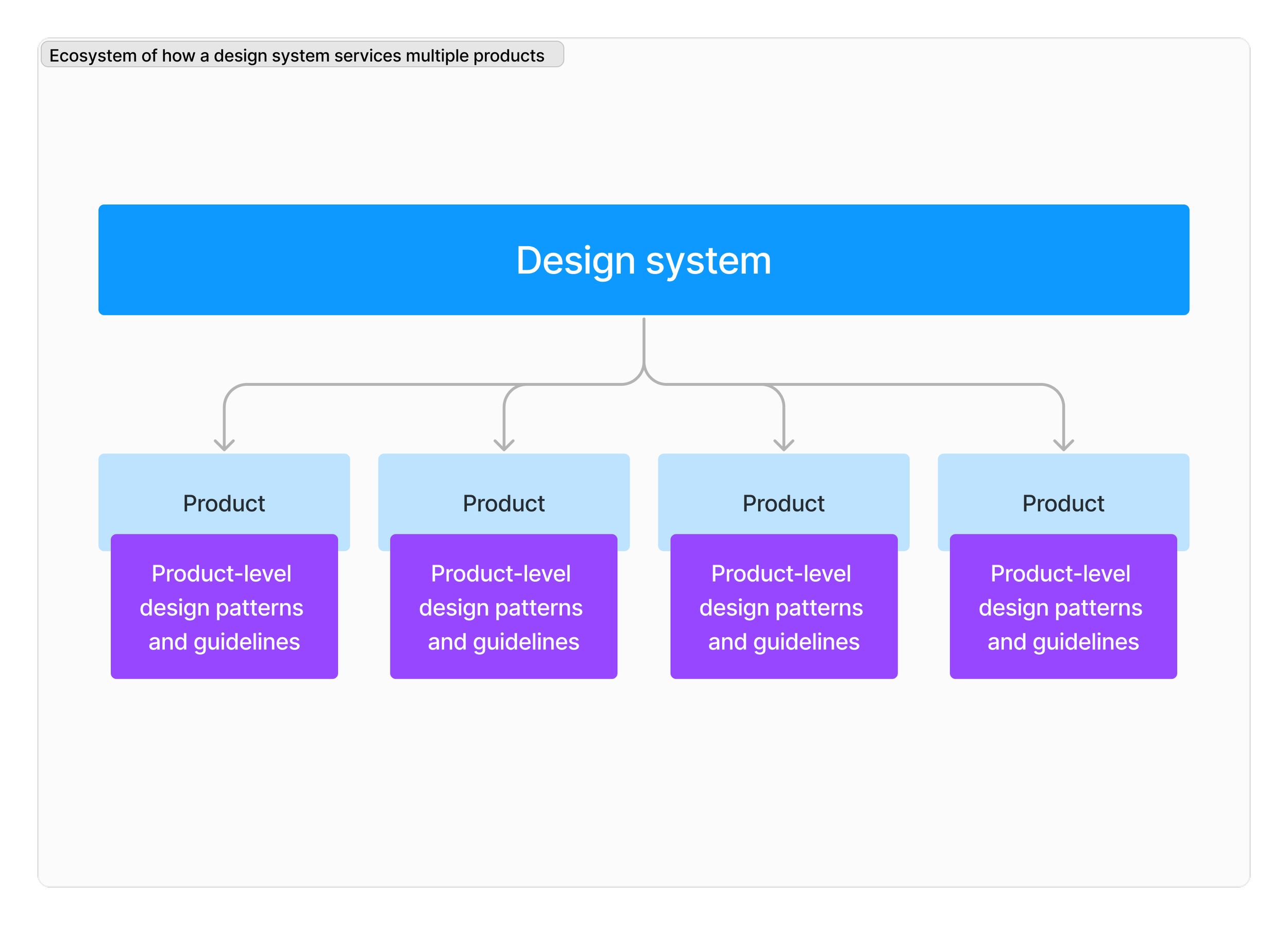
A diagram of how a design system services multiple products and that each product may very well necessitate unique patterns and design guidelines distilled from the design system.
A process was developed to review design system utilization and contribution

A simplified version of the design governance process I created to support the contribution model of the design system, while also ensuring consistency across the user experience of our product landscape.

Impact
The design system migration is now a key operational and financial investment focus for 2024
Negative sentiments and frustrations regarding the system have significantly diminished. Designers now feel valued and are pleased with the newfound attention.
The design system team is enthusiastic about the process and discovery I led, which has bolstered their funding requests and reduced the influx of requests from other sources.
The consumer design team has contributed to the enhancements to over a dozen core design system components
The consumer design team has contributed to three net-new components for the design system
A figma library for common global interface components (utility nav, header, navmenu and footer) is now being actively used across the consumer experience design team