

At a glance
Each year, Irish TItan hosts Ecomm Forum, an industry celebration and networking event. The primary goal of Ecomm Forum is to provide attendees with content and insights that look beyond the present and into the exciting, ever-changing future of ecommerce. Oh yeah, and fun. It's fun, too. Alot of fun.
Audience
Local to regional online merchants and small-business entrepreneurs looking to ignite or optimize their digital presence.
Challenge & opportunity
The event, although hosted by Irish Titan, needed to live independently from the Irish Titan brand, so building an identity that set them apart was the first requirement. It should come as no surprise that we live in a fast-pace, on-the-go world, so accessibility and relevance would also be top-of-mind in designing the experience.
Not only did it need to serve as the event's digital hub, but all information needed to be simple to scan and content had to be easy to understand and useful. Brand distinction online is never an easy thing today. The visual experience had to reflect the spirit of Ecomm Forum and provoke a sense of playfulness, inclusion and invitation.
My involvement
Strategy and planning
Art direction
UX / UI design
Visual design
Brand identity
Content development
Marketing execution (email and social)


Evolution of an identity.
Eye-catching, vibrant, playful, yet strong and professional. It had to be all of that. So here I went. From flat design to CAD design to Geometric to Olympic-like and back again. After an abundance of iterations (too many to show!) the mark started to stick. After recognizing some potential scaling issues early in the process, the logo was simplified and refined into one primary mark. In addition, an abbreviated mark was worked into the mix to play support in situational environments.
A fresh new face.
A look at the final logo lockup (with image and graphical elements interacting in the background) The playful and vibrant supporting colors allow for a well-balanced hierarchy of information and the landscape format works very well on all types of mediums and layouts.

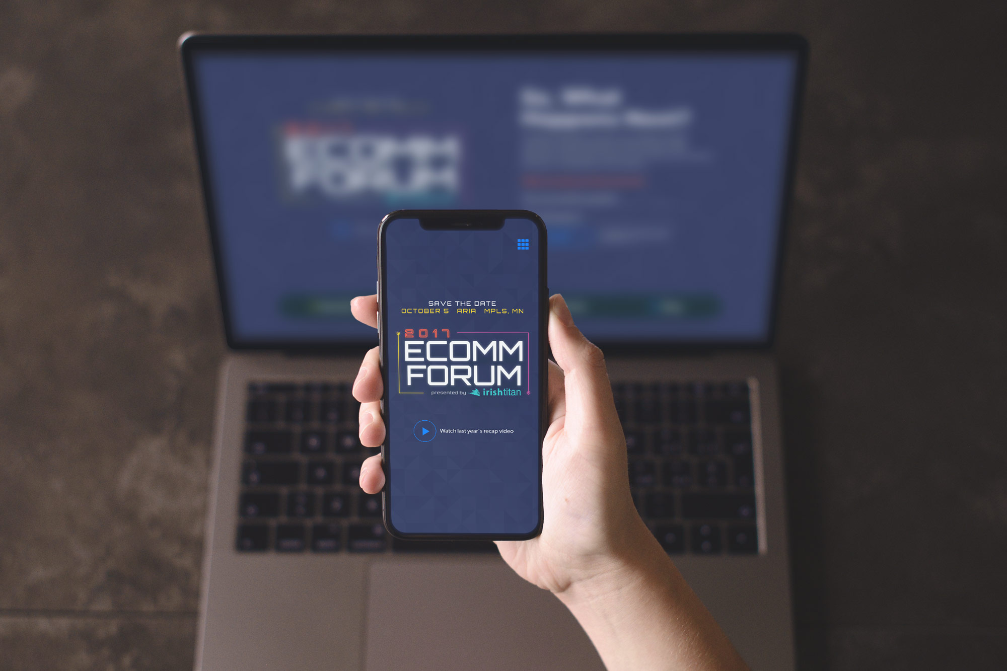
The digital hub.
A clean and colorful direction gave way to minimal, but pertinent event details making the site experience incredibly simple to navigate and explore.


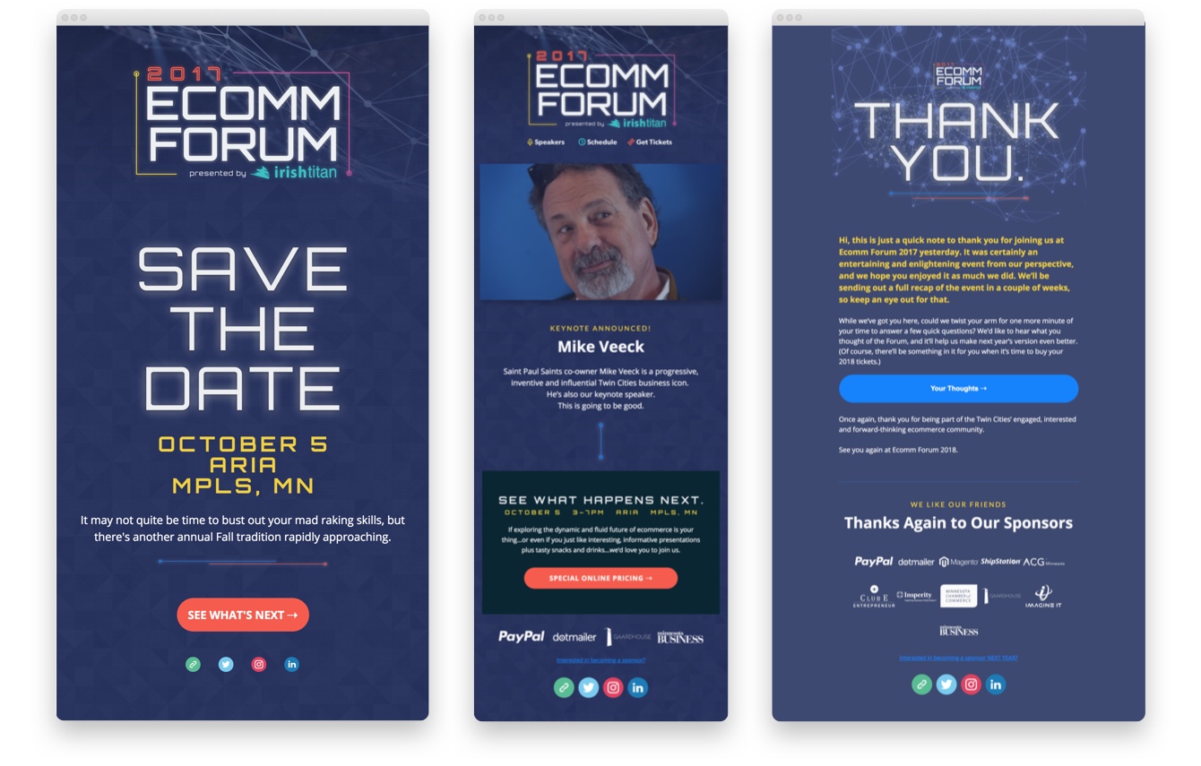
Accompaniment is key.
Along with a well-planned email campaign (pre and post-event), other pieces of collateral included display advertising, social media assets, direct-mailers, event signage, name tags, table tents, animated presentation slides and a digital itinerary.

Takeaway & Results
The design of the website won bronze at AdFed's The Show for "Best Event Website." There were also a few key analytics to mention. Registration increased to 382 attendees which was an increase of 24% from the previous year and email marketing had an avg. open rate of 37.82% with an average CTR of 9%.